 Italian
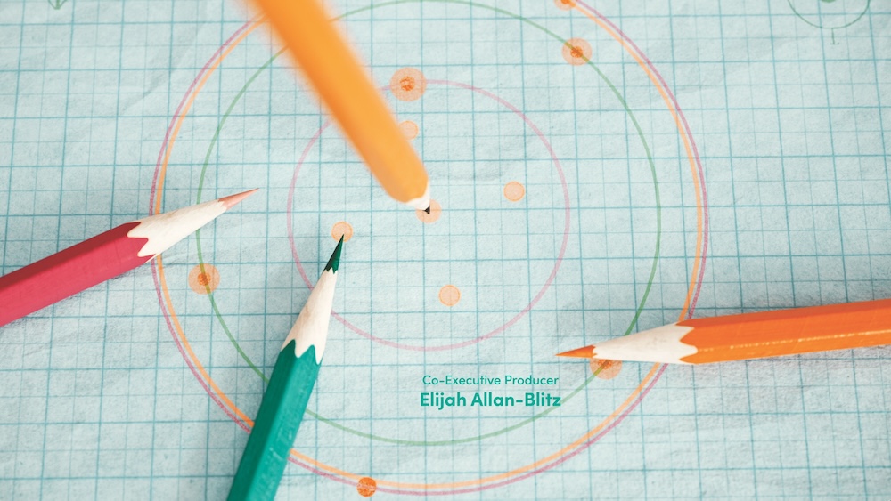
The evolving art of TV show title sequences
A nostalgic look at TV intros
In the 1990s, TV show opening titles were a brief yet star-studded affair, quickly showcasing the cast before diving into the story. Fast forward to the 2000s, and the rise of prestige television brought about concise but visually striking titles, signaling a new era of creativity. However, by the time Patrick Clair entered the industry, the landscape had shifted once again.
“I was fortunate to break into the industry just as streaming became dominant, and every platform was competing to have the best main titles,” Clair recalls. “We had some fantastic years where every major show wanted the biggest, longest main titles. But those days are behind us.”
The impact of the ‘skip intro’ button
The introduction of the “skip intro” button on streaming services has significantly influenced the production of main titles. This feature allows viewers to bypass the opening credits, giving studios less incentive to invest in them.
“The ‘skip intro’ button means fewer shows will have main titles now,” Clair explains. “But the good thing is that it becomes a very intentional choice for a showrunner to include main titles. If they’re there, it’s because they want them to be part of the story.”
Apple TV+ and the commitment to main titles
Despite the trend, Apple TV+ remains committed to producing main titles for almost all its series. This dedication has paid off, with three of its shows—Silo, Palm Royale, and Lessons in Chemistry—earning Emmy nominations for main title design. Other nominees include 3 Body Problem from Netflix, Fallout from Prime Video, and Shōgun from FX.
The creative process behind ‘Silo’
Patrick Clair, a 15-time nominee, snagged three of the six nominations this year, including for Silo. His team worked closely with creator Graham Yost to understand the show’s subterranean world, where humans retreated hundreds of years ago.
“We looked at examples in the natural world of complex life existing underground, like ant colonies,” Clair says. “Ants form intricate colonies that require sophisticated social relationships. This inspired us to think about an inside-out world where humanity thrives underground.”
The resulting title sequence revolves around the silo’s central nervous system, a spiral staircase, visually melded with images of spiral columns and DNA strands. They also drew inspiration from early 20th-century English railway stations, capturing the bustling crowds of commuters.
“You get the impression of thousands of interconnected lives, which led us to depict a river of ghostly people flowing through the silo,” Clair explains. “These haunting images are meant to stick with the viewer, informing the centuries of history embedded in the concrete walls.”
‘Lessons in Chemistry’: A dance of pencils
For Lessons in Chemistry, creative directors Hazel Baird and Rob Cawdery found inspiration in the protagonist Elizabeth Zott’s greatest weapon—her pencil. The concept perfectly complements the show’s zippy theme song, Mildred Bailey’s 1930s tune “Wham [Re-Bop-Boom-Bam].”
“The sequence is pretty much a song-and-dance number,” Cawdery says. “We tried to invoke the kinds of numbers from the 1950s to ensure the sequence fits the show’s time period. Knowing the music from the beginning allowed us to choreograph the pencils’ movements like a dance.”
The series, based on a best-selling novel, had high expectations from fans. “Certain pencils represent different interactions and romantic relationships in her life, infusing a range of emotions into those movements,” Cawdery adds. “We wanted to reward fans immediately and engage others as the series progressed.”
‘Palm Royale’: A visual feast
Four-time nominee Ronnie Koff leaned on story-specific designs for his Palm Royale concept. The title sequence uses simple yet striking illustrations to highlight the social-climbing dramedy’s star-studded cast, led by Kristen Wiig.
“We brought the credits forward, and all the graphic visuals moved around them,” Koff says. The sequence features thematically relevant images like pearls, high heels, brightly colored lips, and pharmaceuticals. Some images, like the tail of a whale, seem random until viewers watch the show.
“Rewarding viewers who stick through the main titles can help the art form survive in a ‘skip intro’ age,” Koff believes. “Giving title sequences a sense of humor and mining the story for ideas allows the audience to feel satisfied they didn’t skip anything.”
The future of main titles
While the ‘skip intro’ button has changed the landscape, the intentional choice to include main titles ensures they remain a vital part of storytelling. As long as showrunners and creative directors continue to innovate and integrate these sequences into the narrative, the art form will endure, captivating audiences and enriching the viewing experience.


